Helping customers find the right part.
Role
Principal UX Design
Date
2015 – 2018
Business goal
Make it easy for customers to find what they need. Give customers the information they need to make an informed purchase.
Success metric
Increase conversion. Reduce returns.
Worked with
Product Owner, PM, Front End Dev
Problem
Customers need help to find the right part for their broken appliance. Also, the Sears Parts Direct website was outdated and in need of a complete redesign.
Research
With most projects I start by immersing myself in all aspects of the issue. For Parts Direct this included looking at the data and analytics, meeting with site stakeholders, doing competitive analysis of similar sites, performing a heuristic evaluation and taking stock of the current site information architecture.
I worked closely with the data analytics team to get a better understanding of the site usage. They gave me access to omniture and showed me how to generate my own reports. At the same time I was creating mental models on how the majority of users are flowing through the site.

Sitemap
I used this to help me organize the site and to mark over how users flow through the site.

Storyboard
Using the define persona and the information gathered from analytics, I built out some storyboards to illustrate a user’s journey.
Coming up with a game plan
Working with the product owners, we prioritized which pages to work on first. The team agreed that the product detail page was the first to be updated. What follows are some examples of the work I did for the detail page redesign.
Product detail page redesign
One of the most important pages on any commerce site is the product detail page. Parts Direct was no exception. Below is a set of wireframes that I created to iterate through some design ideas to test out to see what resonated with users.
My process for design starts with sketching out some initial ideas for a layout on paper, then jumping into wireframes to see how it works in a rough layout.

Wireframe 01
An early wireframe in my process that I explored to clean up the existing design. I applied some information hierarchy to draw the eye to the important parts of the page.

Wireframe 02
For the detail page I channeled some of the lessons learned from my time at Amazon.

Wireframe 03
One important aspect of this page that was missing, but important, was reassuring customers that this part would fit their appliance.
Detail of one module on the product detail page
In doing some of the user research for this project, there was a lack of reassurance that the part would fit specific appliances. Looking at the return data, this further pointed to this need as well.

MVP Mockup
Shown here is an MVP example of the module that I designed for the site.

Wireframe 04
Exploring a design with this module below the buy box.

Wireframe 05
Exploring various approaches to show the team some options.

Wireframe 06
Explored a design with this module above the buy box.
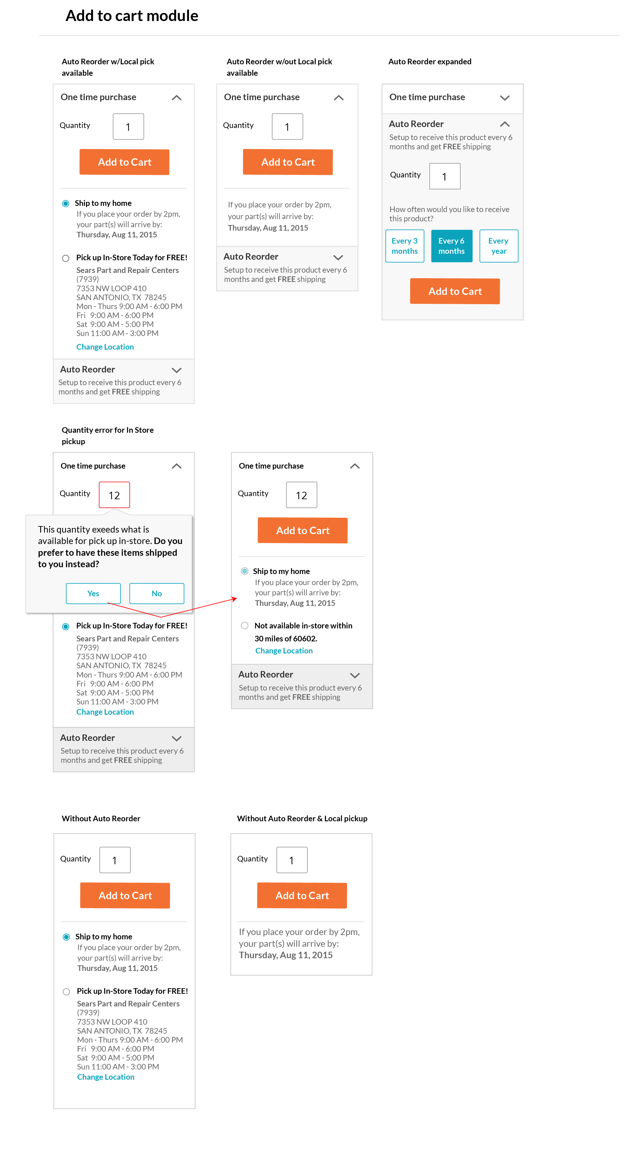
A simple buy box…not!
Parts Direct did have local locations for customers to buy online and pick up orders. Also similar to other sites they had a subscribe service to automatically ship products. These simple features added layers of complexity to an otherwise simple buy box. This is a mockup showing some of those variations for the team to reference.
Launch & Learn: Product Detail Page
Launching a new design can be a humbling experience, especially if you are moving too quickly to do extensive usability testing. The new design did show an uptick in a positive direction. But as with any website the work was far from over. I spent time running A/B studies on possible design tweaks to improve the conversion and also running usability testing on the pages to further improve the user experience.

The tip of the iceberg
The work shown above was a short dive into one of the many projects I worked on. As a principal ux designer for Sears Parts Direct my responsibilities encompassed all areas of the site, from redesigning the home page to improving the checkout flow of the shopping cart. At the same time I worked with the Sears Home Services design team to improve the technician repair network.

Rethinking the homepage
I worked on and launched a new responsive home page for Sears Parts Direct.

Model detail page
A unique page for this site, that provides a list of parts for specific models. This page provides a crucial entry point for SEO.

Shopping cart and checkout flow
Previous versions lacked consistency, optimization and responsiveness.